KP2000: Learner Interface Redesign |
 |
||
Developed for, and |
Prior StateThe story of this redesign is a familiar one for software product development. The KnowledgePlanet user interface had grown up over a number of versions, with the increasing complexity requested by customers being added to the interface in stages, so the application had outgrown its initial design concepts. The amount and types of data being presented needed more room to be displayed, calling for a different approach to navigation. More roles were being introduced, demanding a new mechanism for selecting and managing responsibilities. Additionally, some technical changes needed to be made across all pages in the learner interface, the most significant of which was removing the three-frame architecture and navigation, so the navigation had to be intrinsic to each page. The previous version of the application used a tab metaphor for gaining access to different areas of information, and this was carried over into the redesign. However, the earlier tabs were based on specific features that were in the application, and so often presented different types of information and navigation when clicked, leading to a sense of unpredictability.
Further features were available via a traditional left-hand navigation column. This necessitated the use of very short phrases with no supporting explanation. Also, because these functions were associated with individual tabs, the items available would change constantly, requiring the user to remember where a particular feature was if they wanted to find it again.
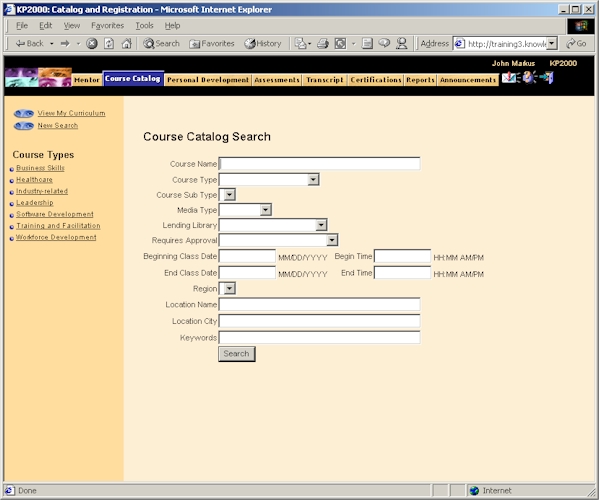
Existing search facilities for such things as courses and assessments were sufficiently rich in the range of search options, but because of this they appeared daunting and did not help the user think about how best to seek the information they required.
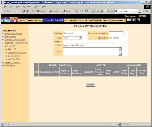
Overall, complex activities (like learners planning their annual personal development goals) had a lack of instructional and navigational support. This put the burden of understanding how to perform these tasks onto the learners themselves, or onto implementation staff who had to train users in carrying out these tasks.
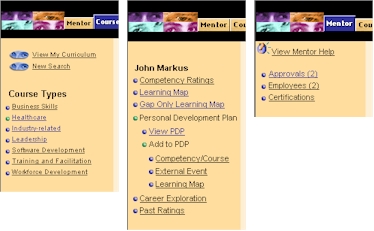
There was a lack of “signposting” regarding the role an individual was performing (managing their own learning, acting as a mentor for others, performing approvals of other people’s learning requests). Switching modes did not necessarily create distinct differences in what the interface looked like, which created confusion (particularly in distracting environments). Additionally, when looking after someone else’s learning, it was not always clear which person was the focus of attention – the application relied on the individual mentor to remember which learner was being viewed, or to read the name when it was buried in the midst of other types of information.
KP2000: Learner Interface Redesign
|
||

|
© Duane Degler 2001-2008