

|
Solution
The over-arching principle of design appears, on the surface, to be a contradiction:
Focus everything on the task in front of you…
but be able to get to anywhere from anywhere quickly.
To allow this to happen:
- the architecture was designed from the ground up focusing on two things – the
specific event and the items for sale
- the interface was designed focusing on the people who the performer would interact with
(customers, suppliers, press, internal management, other staff), allowing the performer to
meet each person’s needs in the most effective and efficient manner
Description is provided on the following:
Structure
The structure of the application is based on the primary activities of the event
business:
- Managing suppliers and inventories
- Managing customer relationships
- Managing press relationships
- Conducting a sales event
- Processing sales statements, accounts and management reporting
Within each section is a "process" which is a group of tasks relevant to that
process – represented along the top of each screen. It is rare for performers to
follow a sequence of tasks at one time. Instead, it is common to focus on a single task,
processing the data for a number of people (customers, suppliers, etc.) within that task.
This leads to "batching" work on specific tasks, where an individual performer
will not look at a task for months, then for a few weeks will focus primarily on it.
However, it is common to have to make changes to data and answer questions across
the tasks on an ad hoc basis. The design has to support rapid data entry and editing of
groups of records (such as inventories of 100-200 items, scanning between 100 registered
suppliers, or auditing 1,000 sales transactions), while still allowing performers to
"jump about" between information views.

Supplier process

Customer process
Common data structures, layouts and field types are used across the activity areas, to
increase familiarity (it also provides a greater degree of data integration for analysis
and statistics).
Return to the top of the page
Interface Layout
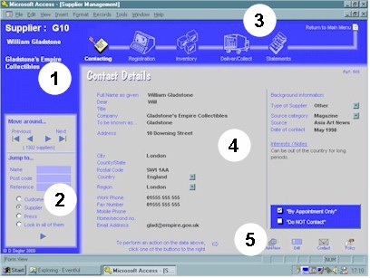
The interface uses a typical 3-frame approach. Even though it is currently developed as
a Windows application, a key design requirement was portability to the web, so the design
reflects both current and future requirements and illustrates best practices in web-based
design. Colors were used to help performers know what aspects of the business they are
dealing with at a glance – a blue theme for suppliers, green theme for customers, red
for press, etc. (colors were assigned partly based on selecting those colors that were
easiest on the eye to be used for those parts of the application where the most time was
spent).

The interface contains the following elements:
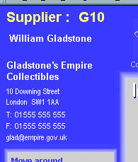
- Top left corner record identifier – shows which person’s records are
being viewed.
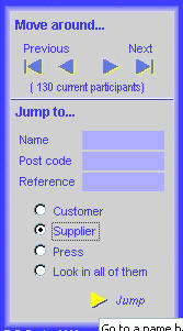
- Left side navigation – the navigation section, allowing navigation by either
stepping sequentially through records (found to be used frequently if within 8-10 names of
the current name) or by "jumping" to a specific record, based on common details
of name, postal code, or reference numbers. The "jump" section allows performers
to respond to ad hoc questions quickly, and then return directly to their work following
the interruption.
- Top "process" bar – illustrates the tasks available within the
process, and allows navigation between the tasks.
- Main form body – data input and editing is done in this area, or launched
from this area. This area also contains snapshot data details that provide status
information about the task relating to that specific person’s records.
- Lower "toolkit" icons – common actions are carried out using small
icons at the bottom of the main body of the screen – these icons are specific to the
actions for the task, and will change from task to task.
Each screen element is shown in further detail below:
- Top left corner record identifier

- Left side navigation

- Top "process" bar

- Main form body

- Lower "toolkit" icons

Return to the top of the page
Information/Support Resources
Secondary information resources were kept to a minimum, based on the experience that:
- the interface provides a great deal of support towards task completion
- business rules and experience should, where possible, be fully intrinsic – either
on the interface or within the automated system functions
- the interface matched the paper documents designed for the business (fields shown,
naming conventions, and sequence in which they appeared), so data input required little or
no interpretation or "wayfinding" between paper and screen
- performers understood the activities involved very quickly once they started, and in the
fast-paced environment the well-placed hint proved more valuable than the detailed
explanation
There are four primary types of support provided, and each is illustrated below:
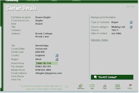
- Tool Tips provide formats and constraints – if there are specific fields that
require uniquely-formatted data that is not able to be constrained by the application
(such as UK phone numbers, which do not have a consistent format), this is provided as a
tool tip to act as a reminder to performers.

- Messages appear when data is "out of bounds" – data is checked as it
is entered, and warning or alert messages will appear only when required so the performer
sees that something needs to be reviewed, while at the same time their work is not
interrupted.
 
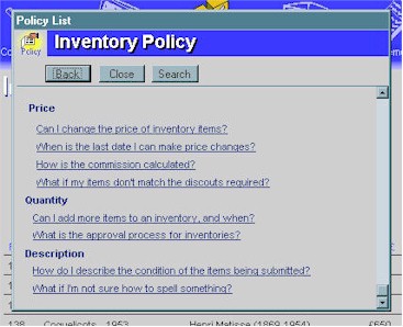
- Policy information is one click away – specific policies that relate to
the type of task being performed are available via a button at the bottom of the screen.
Policies are listed as questions, because the need for clarification often comes up as a
result of a question from a supplier, a customer or the press.

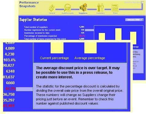
- Alerting/interpreting notes, primarily in management reports, give
basic descriptions of the data being presented and what it means.

Return to the top of the page
Automatic Data Checking
One challenge in data input appears in a number of areas:
- there is a need for data to be as consistent as possible from one record to another, to
allow summarizing and statistical analysis
- there is no way to predict in advance what the data will be, so the data cannot be
converted into drop-down lists or common categories for selection
The application uses the data that already exists to form the basis by which data
quality is checked – capturing knowledge from early data entry work to provide the
basis for ongoing data quality.

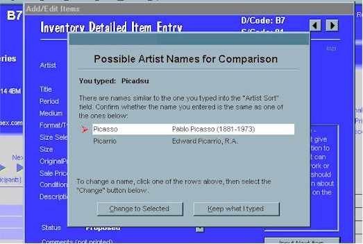
For example, in the case of an artist name, it should be represented in whatever form
is desired by the supplier (as written onto the inventory). However, to create the list of
artists represented, the performer puts the last name into a "sort" section
(this is automatically copied once it has been done one time). At times, the performer
will mis-type a name – which would produce two entries in the resulting summary if
not checked. The system scans what has been put in and then looks for likely matches,
presenting these to the performer to confirm whether it is a new name, or a typo of an
existing name. This means the performer does not have to know, or memorize, thousands of
names and other details about the very specialized subject domain.
Return to the top of the page
Return to the top of the page
"Eventful" -
Performance-Centered Event Management Application
introduction
the users
solution
attributes
|


